Every so often, we interview one of our designers to give you a behind-the-scene glimpse of how the magic happens.
Today we talk one of our premier interior designers, Sandy Fandre, who comes from the windy city of Chicago. After working for a decade for the well-known architectural firm, Skidmore, Owings, and Merrill, she decided to move to the warmer climate of Florida.
IBSG is lucky to have her use her multiple talents and vision of clear, pure design for both residential and commercial projects.
IBSG: How does the use of color affect your design?
Sandy: To me, color is a means to an end. Color allows us to achieve special effects and fulfill our client’s expectations of an overall ambiance. To follow color trends and treat high end interior design as an extension of the fashion industry is just not taking advantage of the power that color yields.
I have always thought that it was wrong to refer to color schemes with a single color, like a favorite color as a child, when the most interesting things happen when you juxtapose multiple colors or play lights against darks, brights against subdued colors.
I studied color at Northwestern University, where the head of the Art Department had traveled to Germany to take a course on how to teach color given by Joseph Albers, who painted Homage to a Square. There was a beautiful art book that was published by Albers to go with this course. It was a very hands-on course, mixing paints and layering silk screened papers.
The object of the course was to demonstrate that color does not exist without adjacent colors changing it. The same color will appear one way against one setting and be a completely unrecognizable color when used a different way, so how can you name or define it, if it is so elusive.
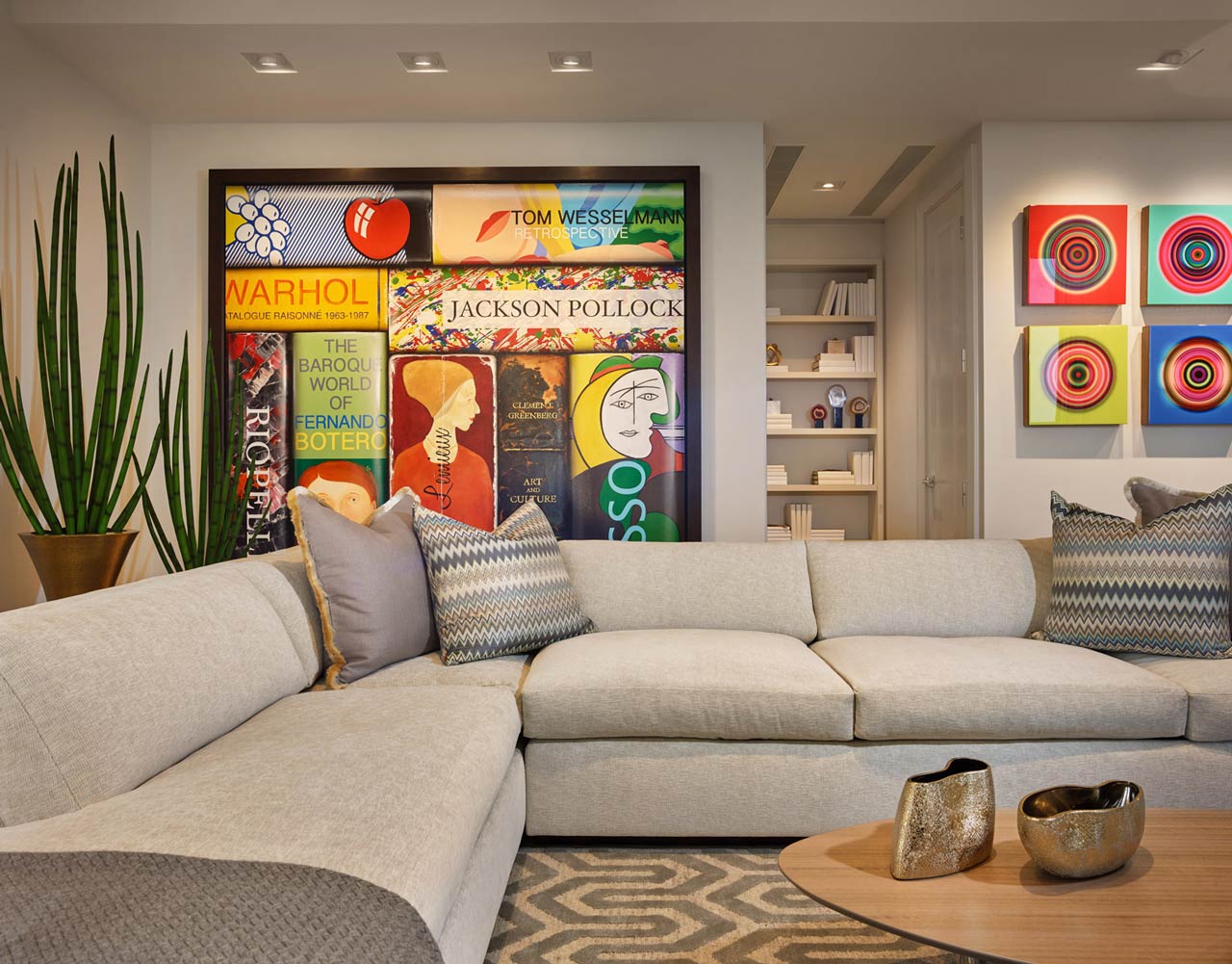
You can combine colors in such a way that they actually vibrate. Accents can be calculated to the best advantage. I have been playing with color ever since. I love to use color to create a feeling of warmth, or peace, or excitement, or whatever the client wishes.
Homage to a Square, by Joseph Albers
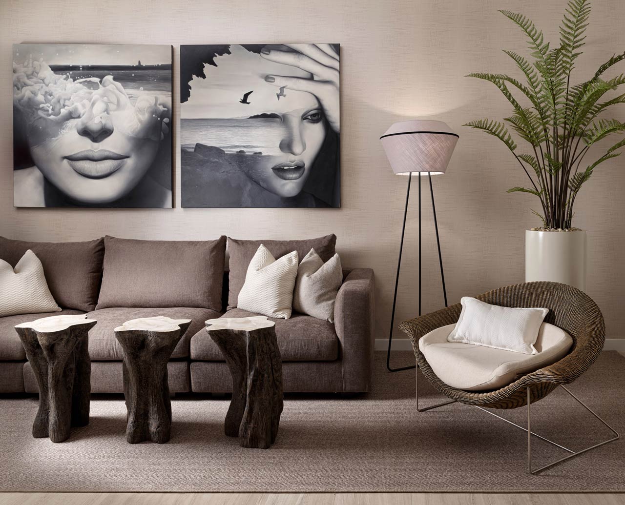
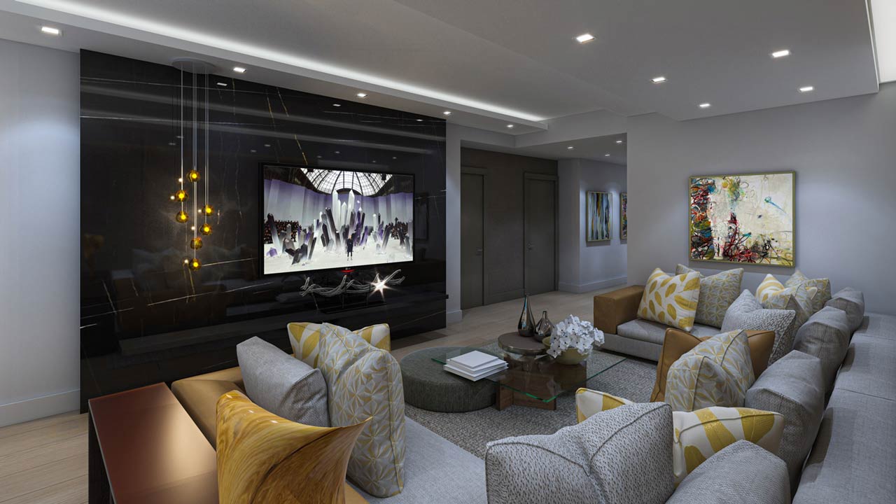
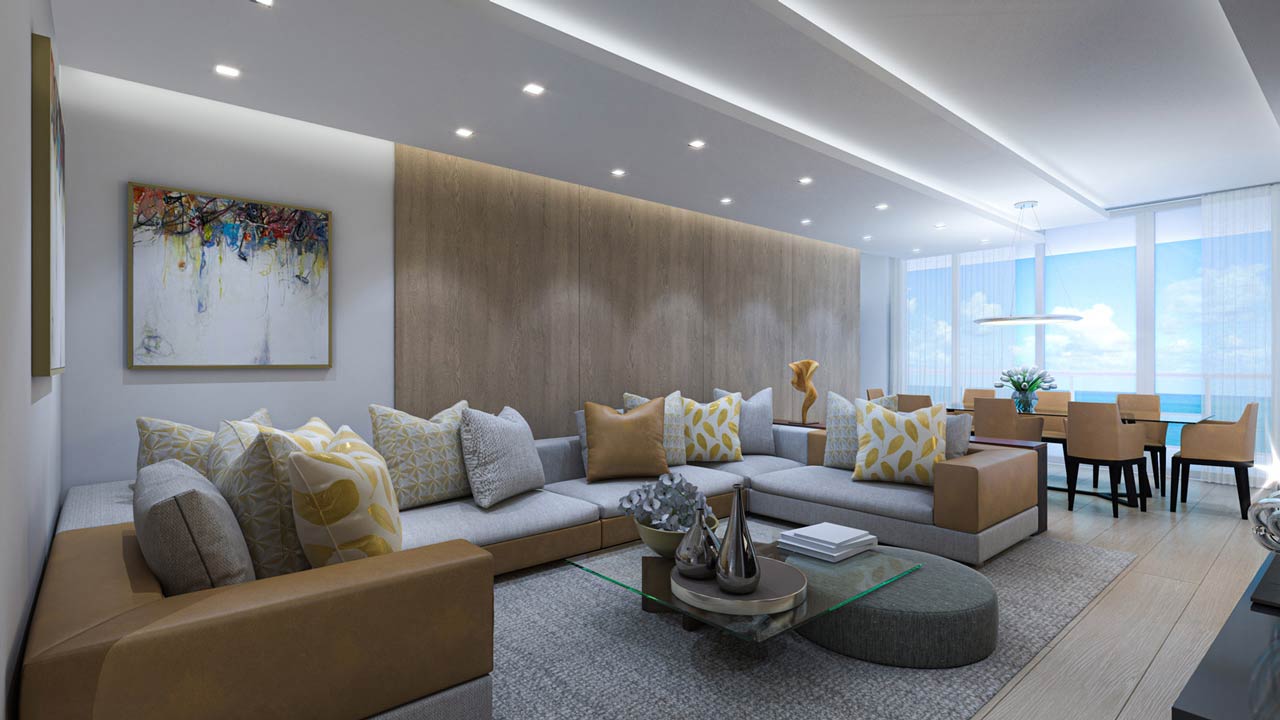
A tranquil design is created with color, with a little passion thrown in.
A soft mix of warm inviting colors and patterns.
In the same residence, a more dramatic expression of the warm color scheme.
Purple in the master bedroom adds a sophisticated and elegant sense of a retreat from the chaos of South Beach.
IBSG: What determines the style of furniture you decide to use in a residence?
Sandy: As visual storytellers, quality interior designers rely on furniture as their words, their vocabulary.
This custom dresser was inspired by the beauty of the artistic pulls – the punctuation in the vocabulary of design. The pulls cost over a thousand dollars, so they really should be regarded as artistic.
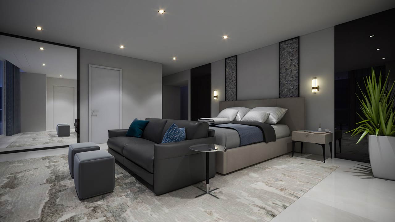
This master bedroom was designed to be light and airy. The furniture floats. The glass and lacquer nightstands are supported by the wall, an expensive coordination by the general contractor, glass fabricator, and millworker. The glass and mirror in the room are treated as structural and are deceivingly durable and easily maintained.
This credenza was designed to add texture and an organic feel to a background that is peaceful and understated.
This custom commercial Wii cabinet for a club room is part of an interesting story with the simplest of elements. The television bracket was the most extravagant expense – $500. If we would have had a bigger budget we would have used similar brackets to float the cabinet, as well.
IBSG: What is the future of quality interior design, as you see it?
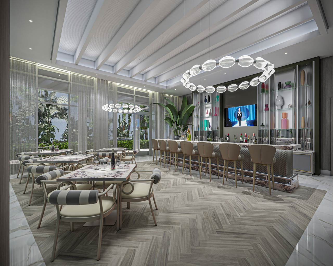
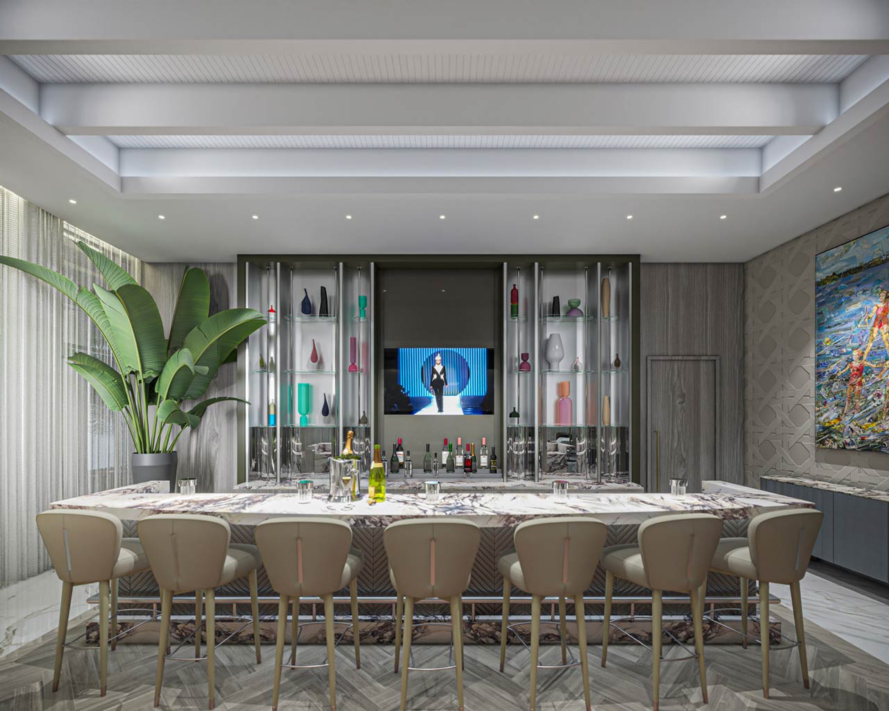
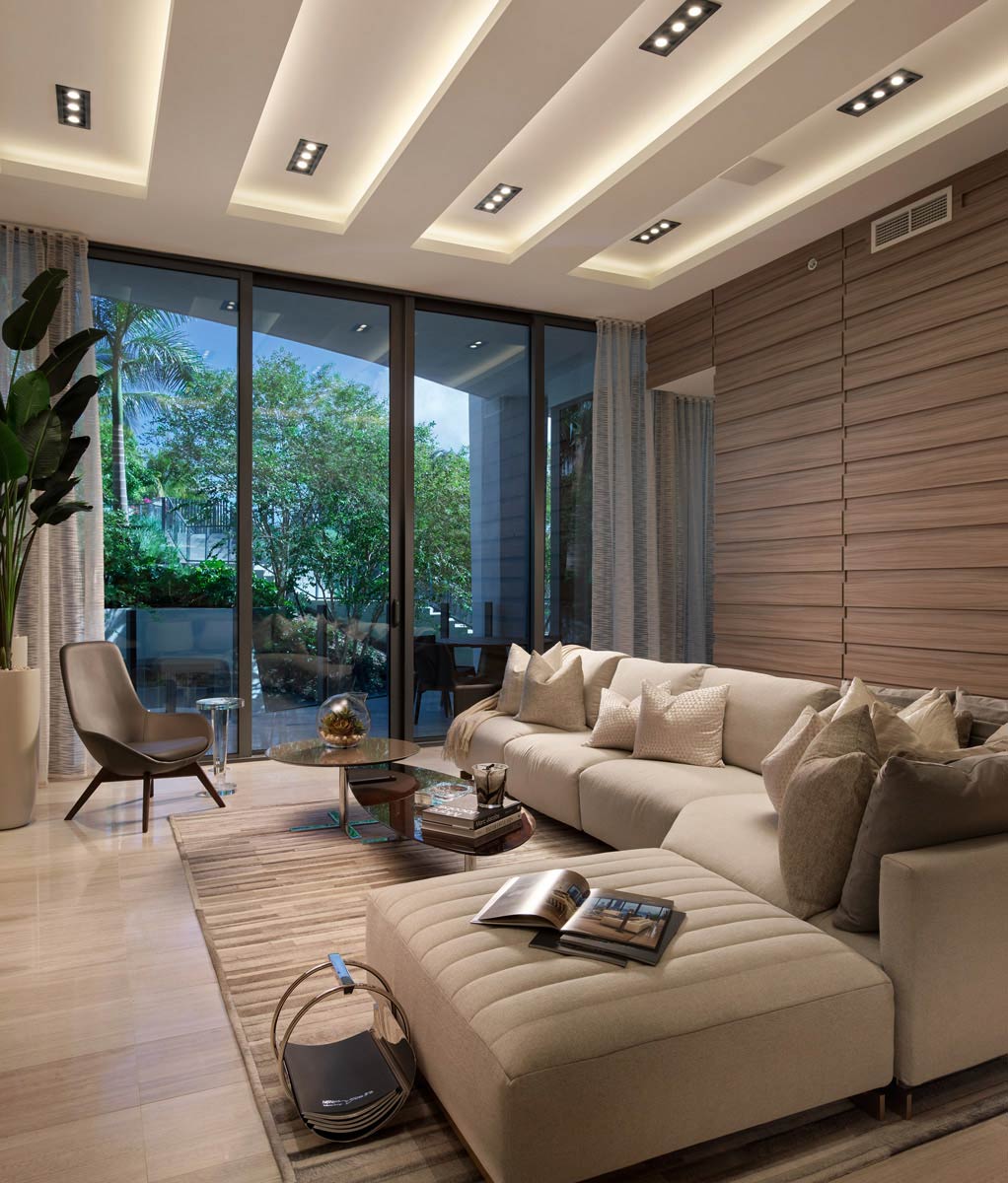
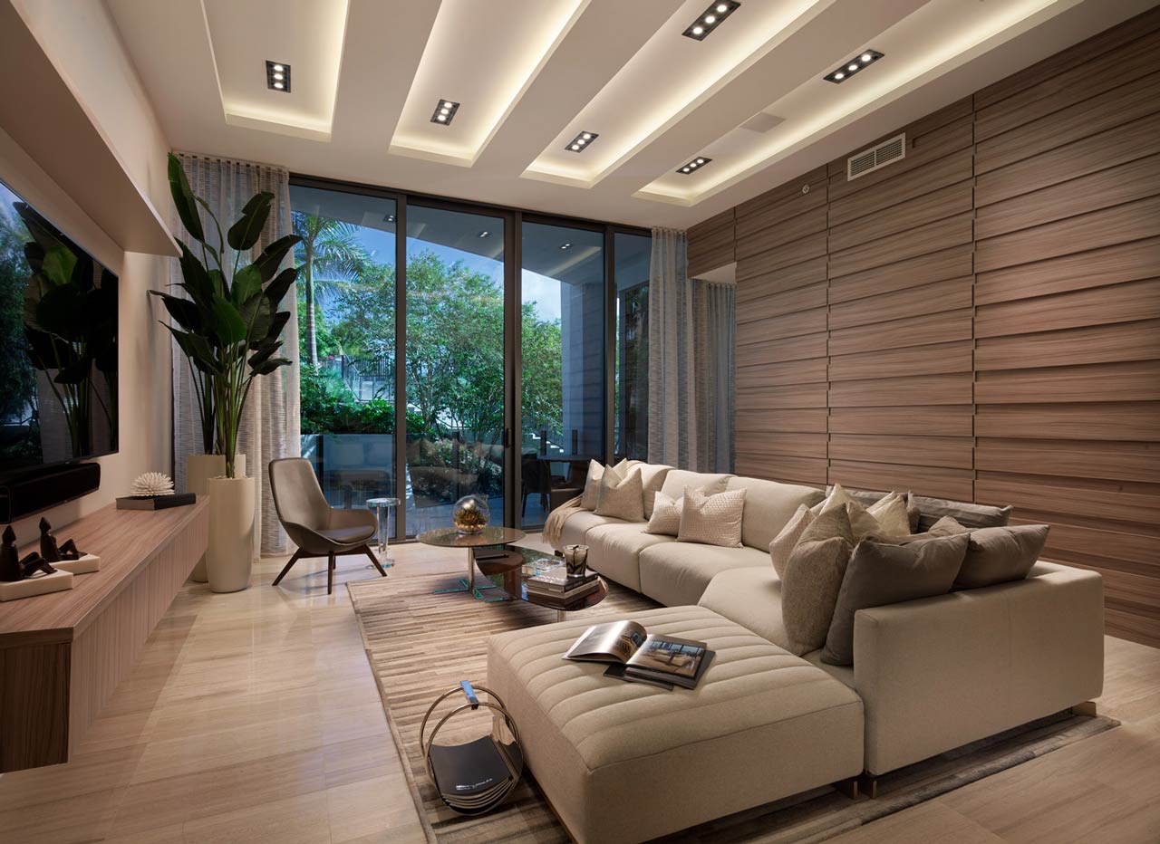
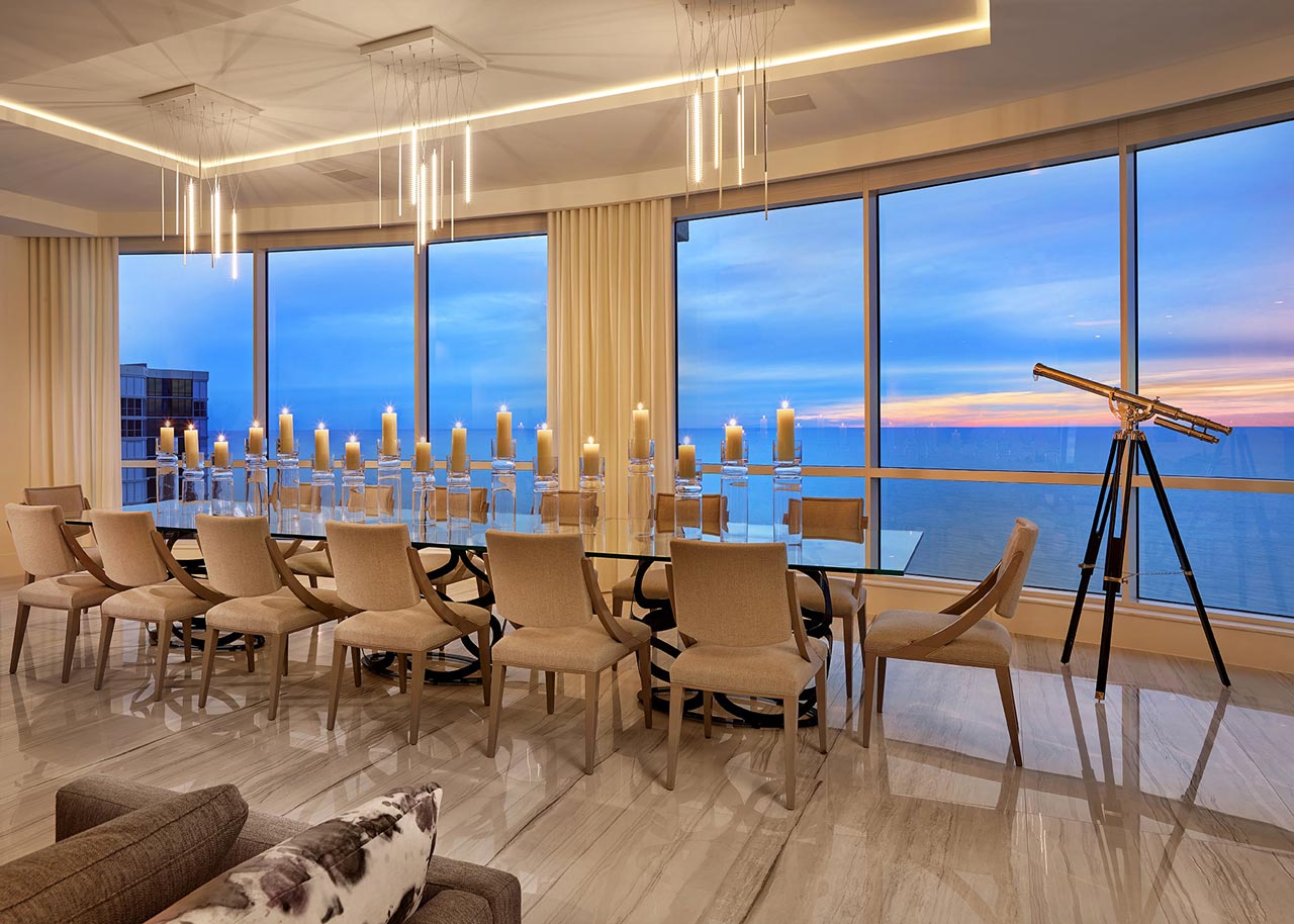
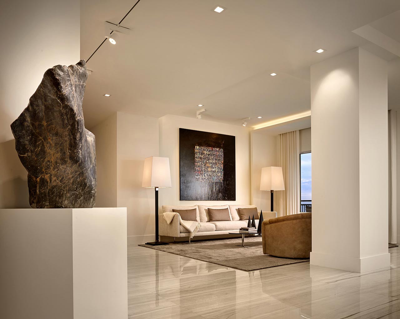
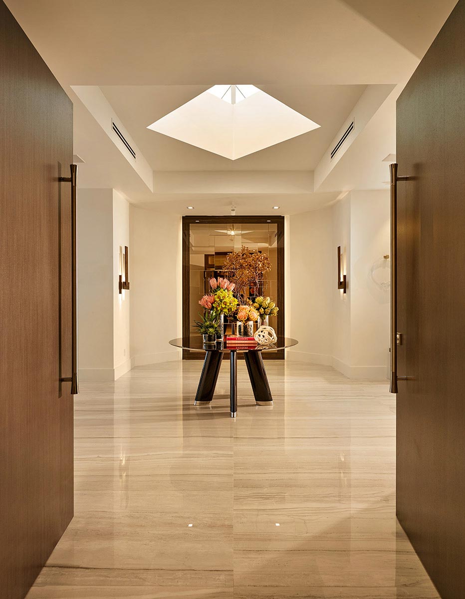
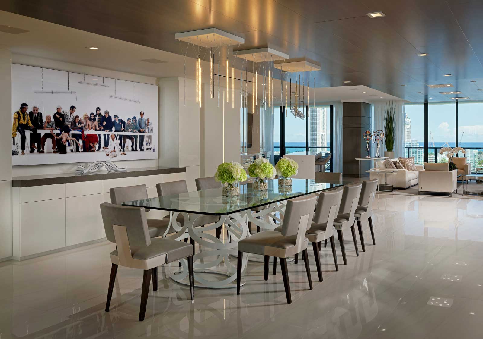
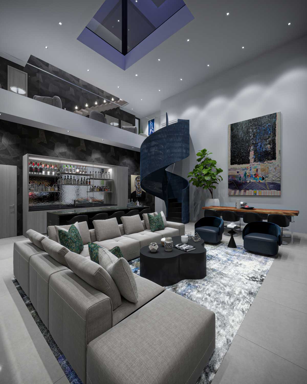
Sandy: Design is changing most rapidly in the field of lighting, with ceilings and walls contorting and following the lines of the new expressions of light. The possibilities are exciting.
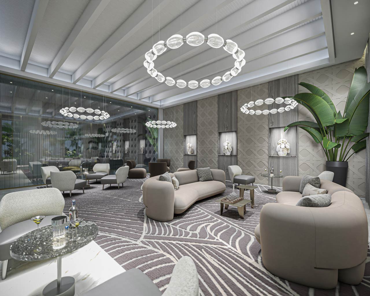
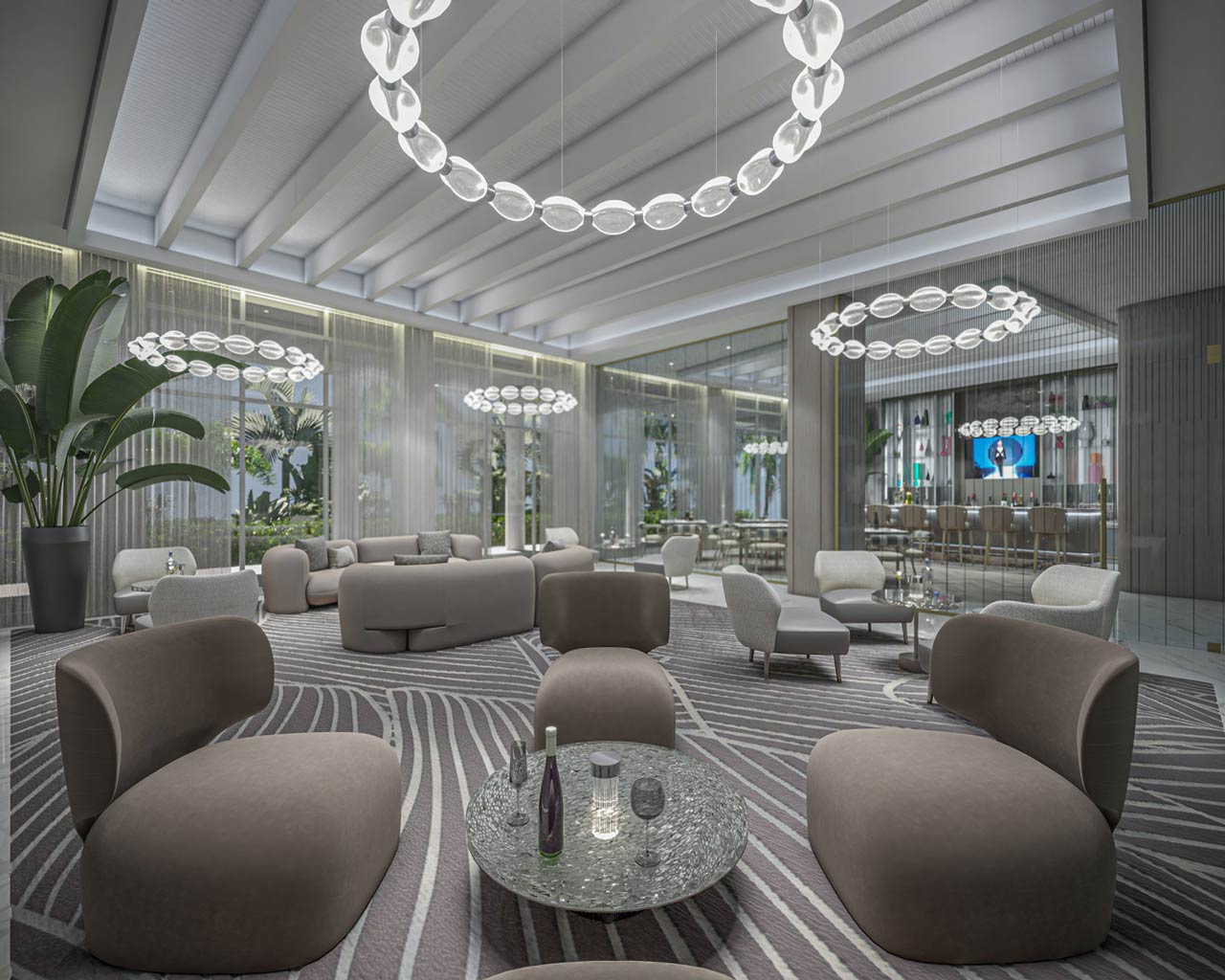
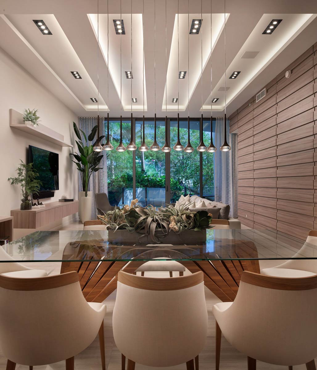
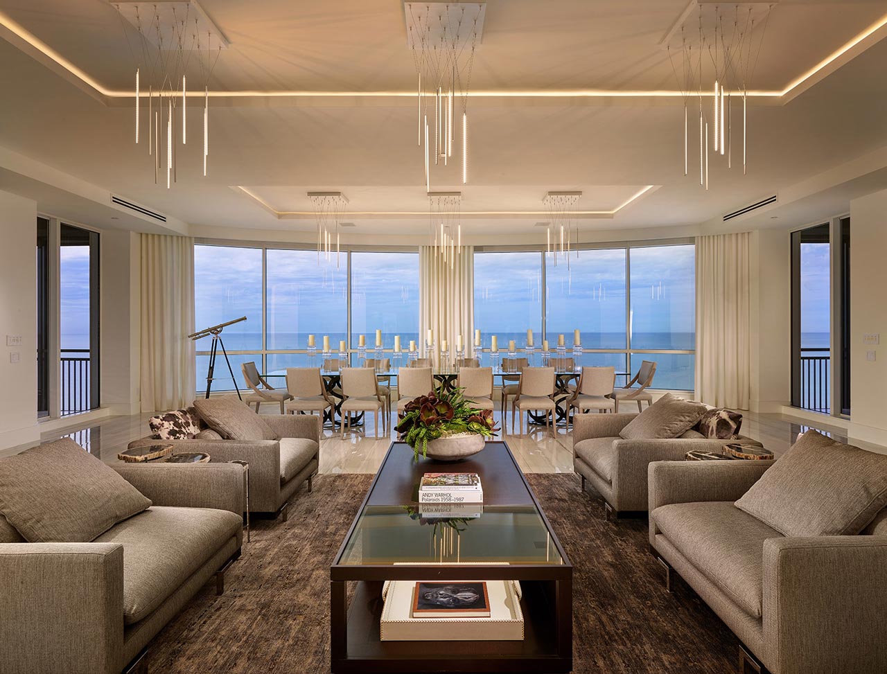
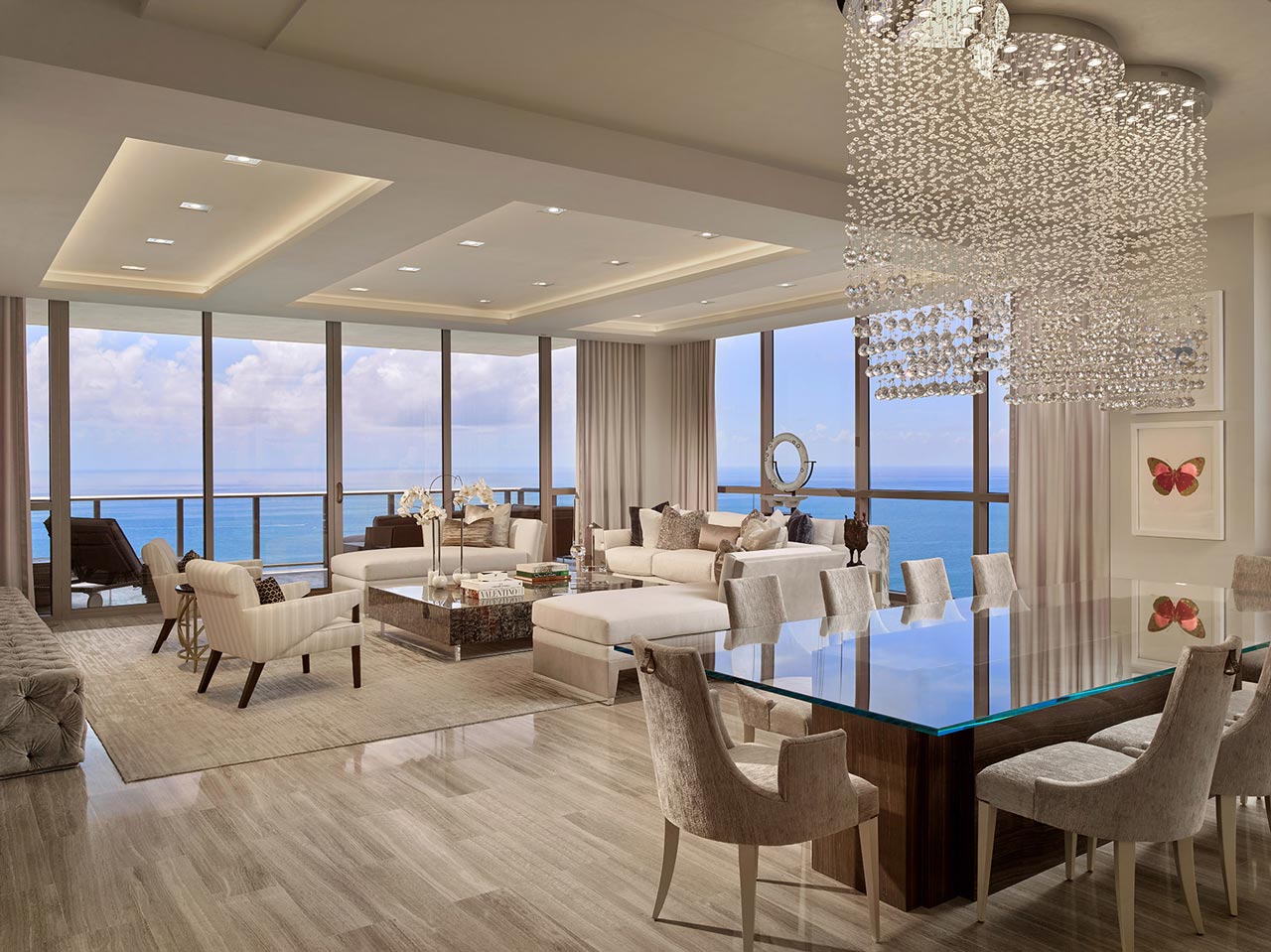
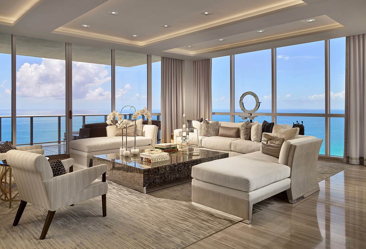
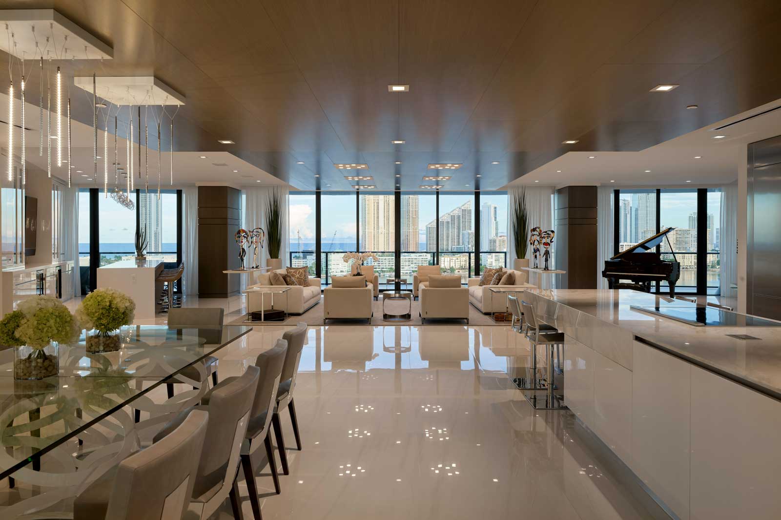
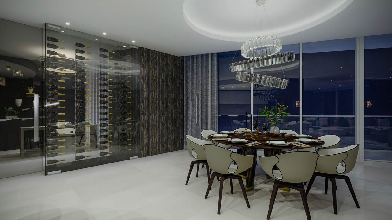
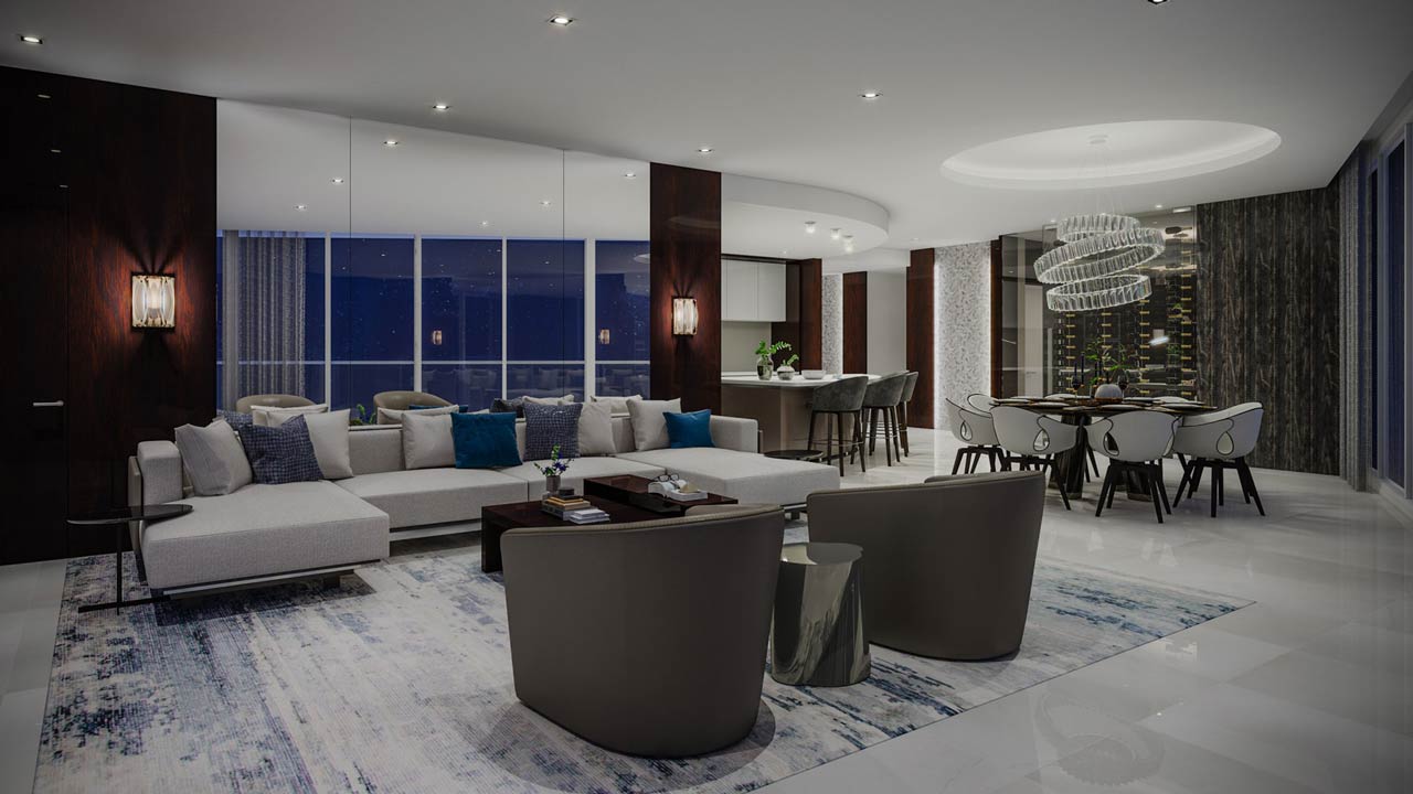
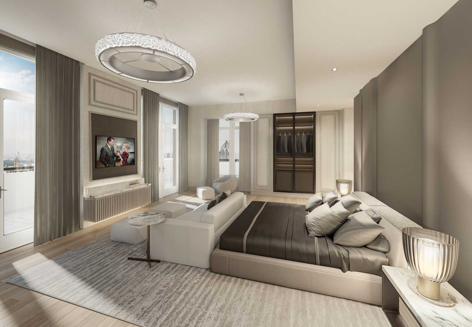
The sculptural ceiling defines the furniture layout below. It is no accident that the area rug is the color of a shadow of the ceiling above.
Light as art
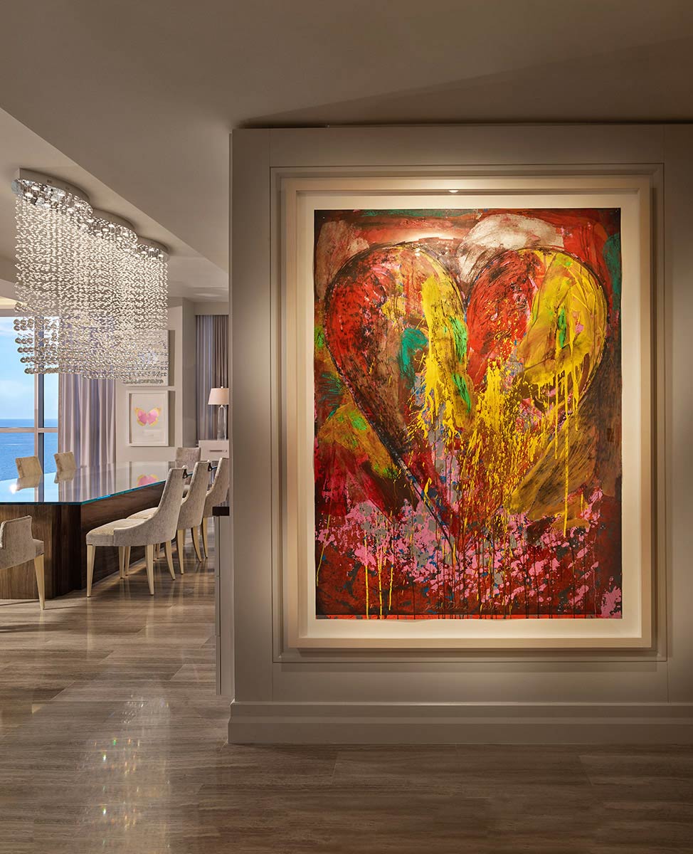
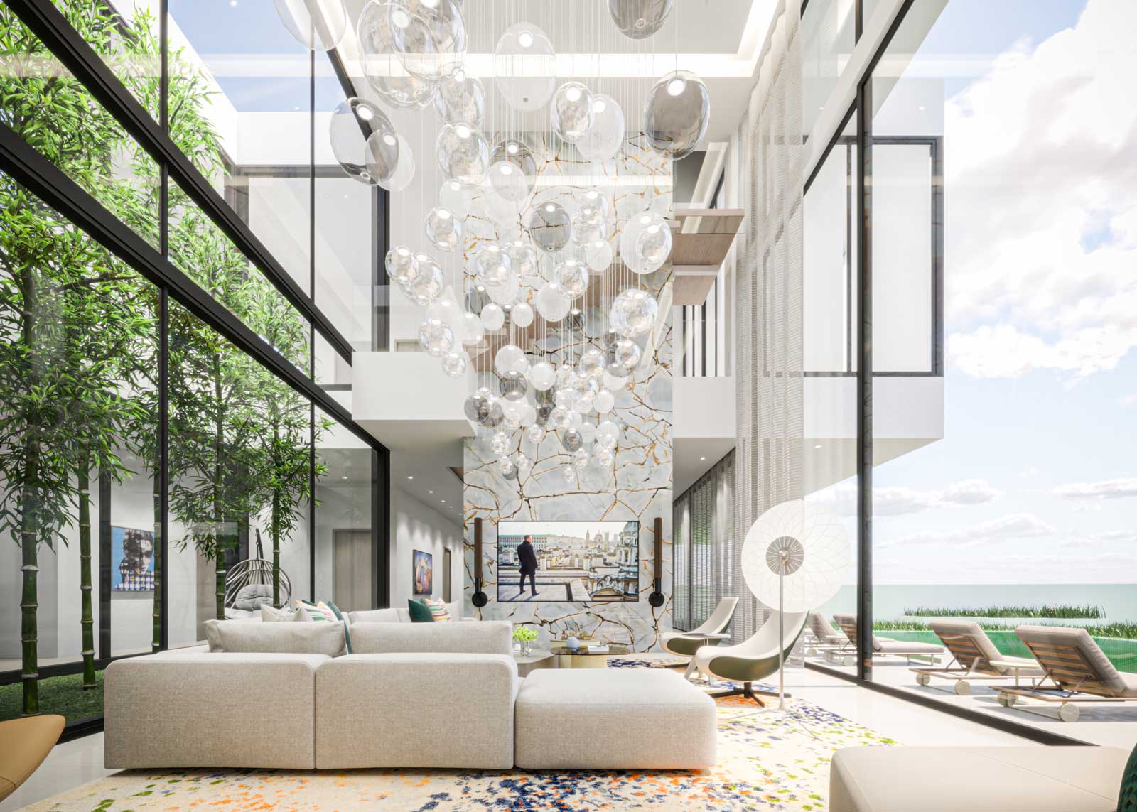
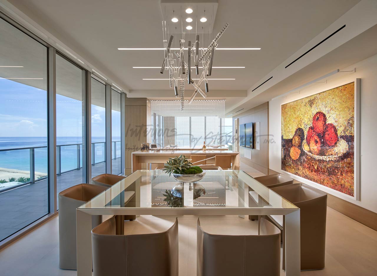
Sculptural light fixtures, lights designed in studios as art, floating in space.
When sconces would disturb the lines of the space, a light slot in the mirror meets the need to see.


